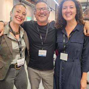
NEWH UK Art Auction Event Round-up
We were delighted to host the NEWH Art Preview and Auction event at our studio in Clerkenwell and what a night we all had raising money for the Scholarship Funds.…
This screen helps to save electricity when you are not using your web browser.
To resume browsing, just click anywhere on the screen.
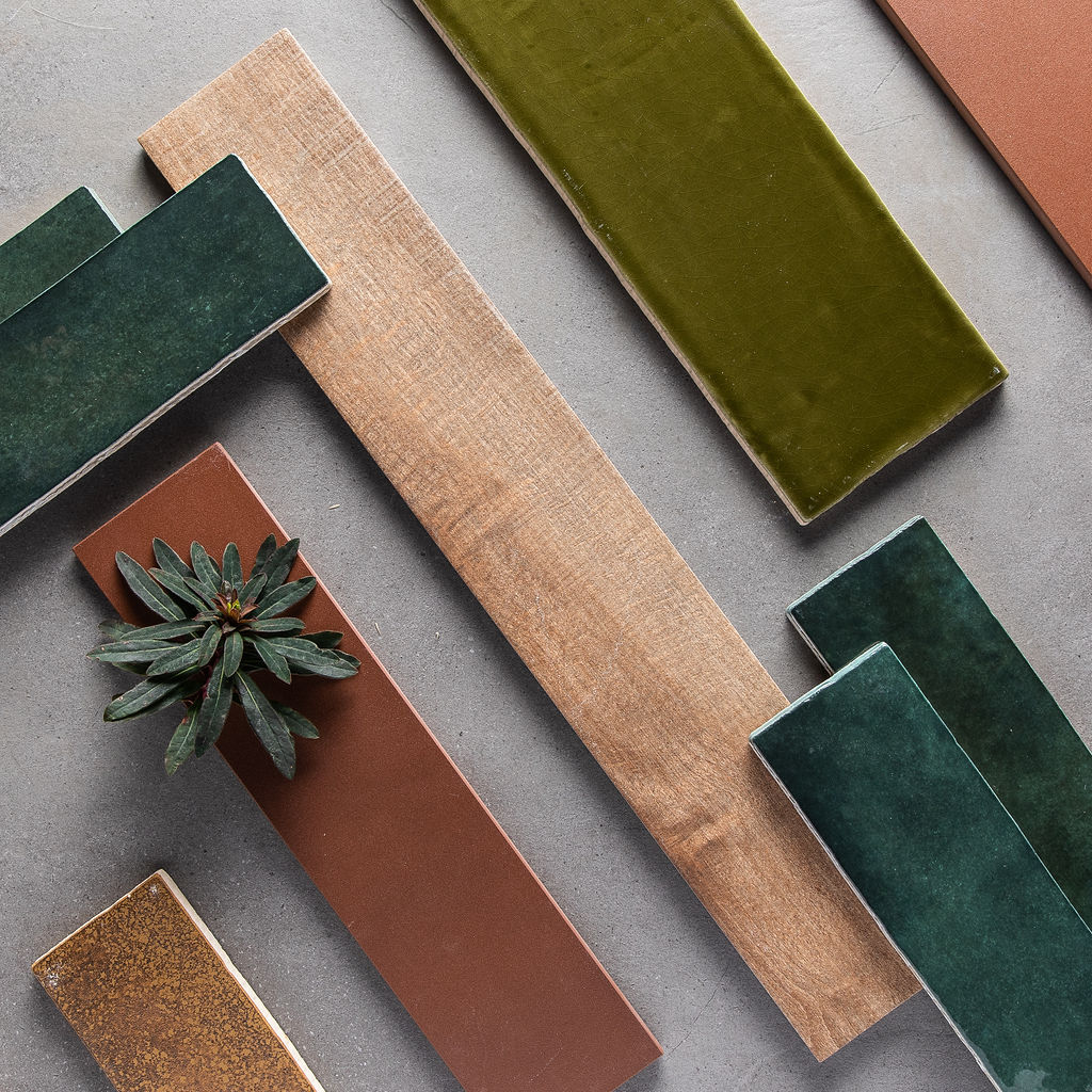
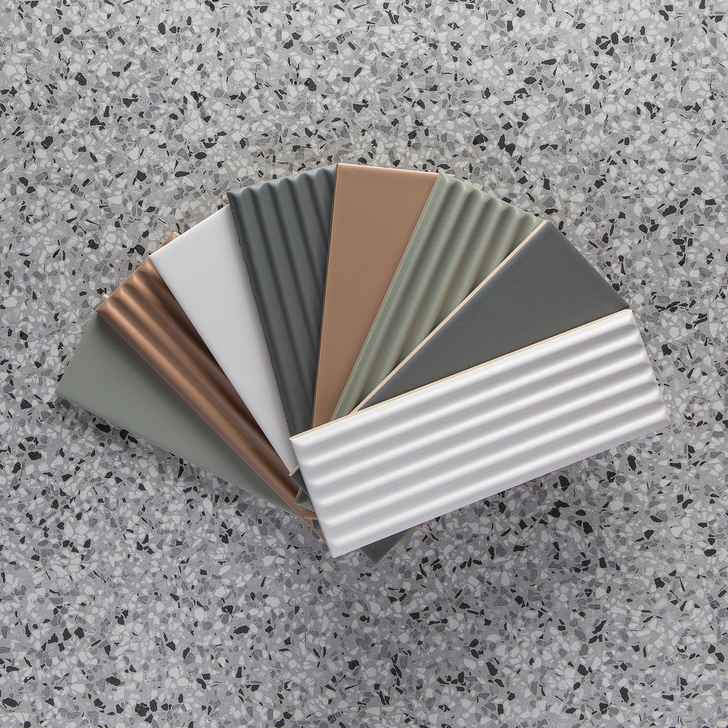
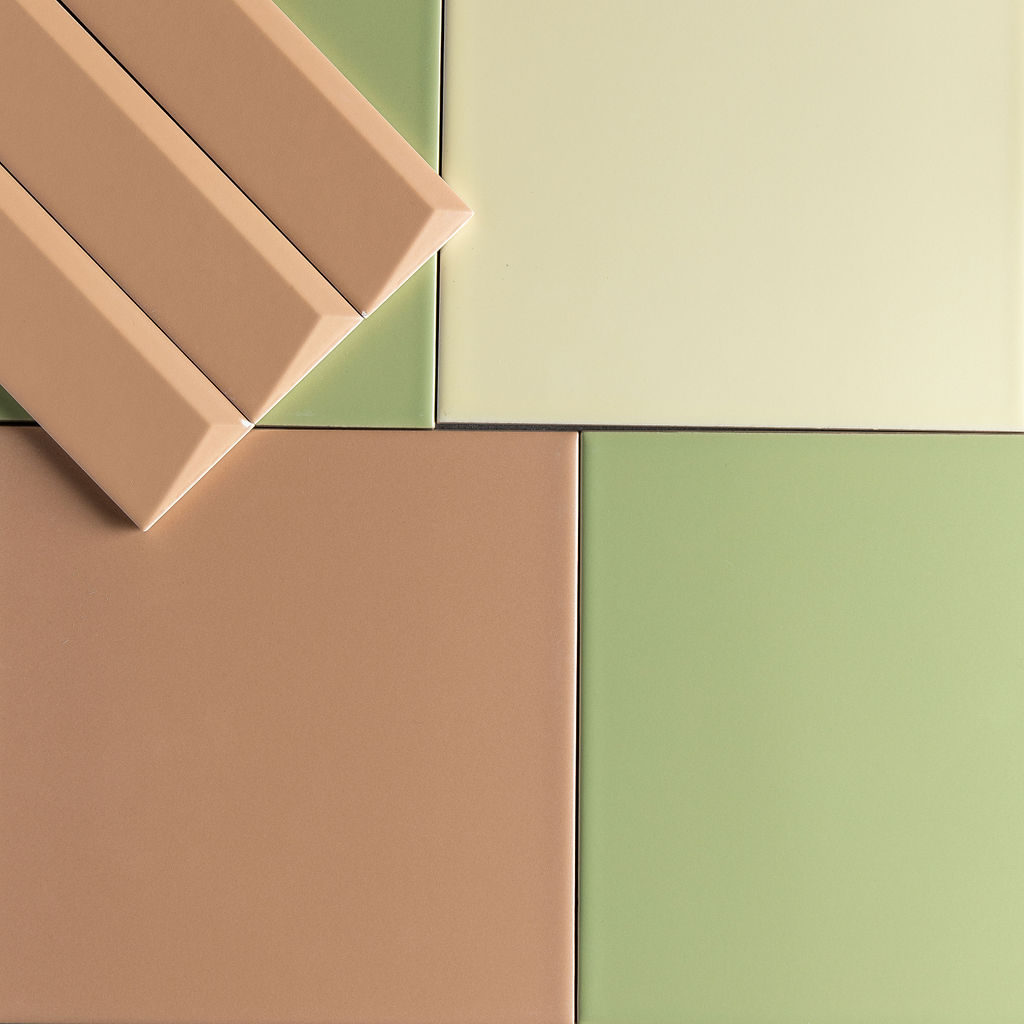
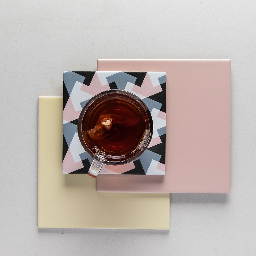
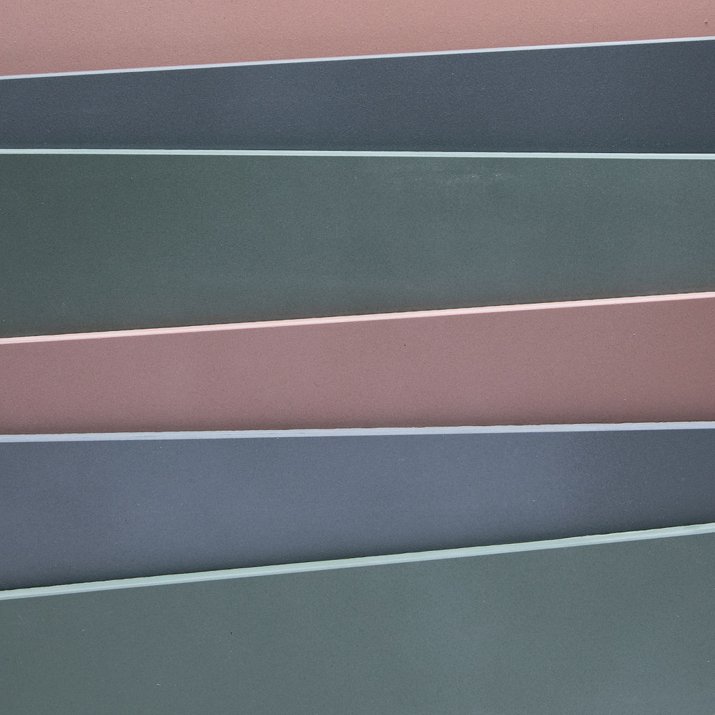
With the Covid-19 pandemic causing the biggest disruption to modern life in many generations, our response looks to shield us from the economic uncertainty, social isolation and endangered health. A desire for interiors that can accommodate agility as well as provide retreat to make us feel calm and safe, will shape the colours, surfaces and patterns we see.
Encouraging a positive emotional response that helps to relieve feelings of anxiety and uncertainty, colour is playing a more influential role, with palettes that offer depth and richness. From saturated, digital tones to rich and authentic natural colours such as moss and deep forest green, colours are bolder and help users connect to the space in meaningful ways.
These colours can be grouped into clear themes that bring cohesion to a colour, texture and surface palette. We have identified two key themes for 2021/2022 in Nature’s Purity and Retro Pop.
Nature’s Purity explores the positivity of nature’s influence on our interiors. As we seek a deeper connection to the natural world, it looks towards colours, surfaces and patterns that respond to this. Warmer, earthy ones are paired with natural materials that evoke a sense of purity and perfection. Lending itself well to creating an immersive hospitality experience through new neutrals and natural textures such as marble and wood, Nature’s Purity fosters a link to the outdoor world that helps to instil calmness and serenity in any commercial interior.
Retro Pop sees a return to nostalgia, with the bold, geometric patterns of the 70s resurging, this time with a sunnier palette rooted in citrus yellow. Sweet pastels add energy and help to build playful spaces that encourage wellness, collaboration, connection and socialisation. Bringing fun and joy to workplaces and retail, Retro Pop sees ceramics, satin finishes and terrazzo clash for fun combinations that retain a feeling of positiveness.
Through over 1500 tile designs, we can provide designers with wall and floor tiles to bring these trends to commercial projects. Whether the faithful colours of the Matrix collection or marble, wood and textile effects; We support solutions with a range of services including waterjet cutting, colour matching and bespoke digital print.

We were delighted to host the NEWH Art Preview and Auction event at our studio in Clerkenwell and what a night we all had raising money for the Scholarship Funds.…
Supporting its studios in Leicester and Clerkenwell, and space at Material Source Studio Glasgow, Parkside Architectural Tiles is now part of Material Source Studio Manchester. Leading tile specification business,…